Responsive Web Design Basics: A Beginner’s Guide
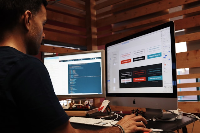
In today’s digital world, users access websites from phones, tablets, laptops, and desktops—and they expect a seamless experience on all of them. That’s why Responsive Web Design (RWD) has become essential for anyone building websites. Whether you’re just starting out in front-end development or diving into UI/UX design, understanding how to make your site adapt to different screen sizes is key. As you learn and experiment with responsive design, tools like Hex Calc can come in handy—especially for converting hex values, debugging colors, or working with digital data formats that are often used in web development projects.
What Is Responsive Web Design?
Responsive Web Design is an approach to building websites that allows them to adjust and look great on any device, whether it's a smartphone, tablet, or desktop. Rather than creating different websites for each screen size, a single responsive design uses flexible layouts, fluid images, and media queries to automatically adjust the layout and content.
Why It Matters:
Improved User Experience
Users expect a site that works and looks good no matter how they access it. RWD ensures they can navigate and consume your content comfortably.Better SEO
Google prioritizes mobile-friendly websites. Responsive design helps your site rank better in search engine results.Cost and Time Efficiency
Maintaining one site is far easier than managing multiple versions for mobile, tablet, and desktop.
Key Elements of Responsive Design
1. Fluid Grids
Instead of fixed-width layouts, use relative units like percentages. This allows your layout to scale fluidly with the screen size.
.container {
  width: 90%;
  max-width: 1200px;
  margin: 0 auto;
}
2. Flexible Images
Images should resize automatically within their containers.
img {
  max-width: 100%;
  height: auto;
}
3. Media Queries
CSS media queries apply different styles based on device characteristics such as width or resolution.
@media (max-width: 768px) {
  .navigation {
    flex-direction: column;
  }
}
Mobile-First Approach
Designing for mobile devices first ensures that your site functions well on small screens before adding enhancements for larger devices. This approach helps you focus on the essentials and then progressively enhance the experience.
Benefits of Mobile-First Design:
Prioritizes performance
Forces clear content hierarchy
Easier to scale up than scale down
Tools & Frameworks That Help
Several modern tools can help you get started with responsive design:
Bootstrap – A front-end framework with a responsive grid system
Tailwind CSS – A utility-first CSS framework with built-in responsive design classes
Chrome DevTools – For testing your design across multiple screen sizes
Common Mistakes to Avoid
Not Testing on Real Devices – Emulators help, but testing on actual devices provides a better sense of usability.
Ignoring Touch Navigation – Make buttons large enough and consider gestures for mobile users.
Overloading with Content – Keep your mobile layout clean and focused on user needs.
Wrapping Up
Responsive Web Design isn't just a buzzword—it’s a must-have in today’s multi-device world. By learning how to use fluid layouts, media queries, and mobile-first practices, you can build websites that look great and perform well everywhere. And when you’re working with color schemes, debugging values, or converting between number systems, don’t forget to use HexCalculator.org. It’s a developer-friendly tool that can help simplify your workflow, especially when dealing with hex values in CSS.